MORE THAN A JUST A DISCOUNT MARKET PLACE.
Campaign Objective
2020 GROUPON REBRAND.
Business Situation.
In 2020 there was a pent up demand from consumers (due to the pandemic) to get out and have more experiences, and Groupon’s goal was to become the world’s best marketplace for local experiences and things to do each and every day.
The Challenge.
Consumers often think of Groupon as a deals website, a place to buy both goods and services vs experiences. Groupon needed to change consumer and merchant perceptions and definitively own their role as the place to discover experiences.

OPPORTUNITY
It was a zeitgeist moment for Groupon. Experience deprivation caused by the pandemic had people chomping at the bit to get back out there. Local businesses all-over were opening back up and needed to build back their customer base.Even the most established brand must reinvigorate its fans and followers. After 5years, Groupon’s Brand Identity was overdue for a much needed makeover in order to remain competitive in a growing global e-commerce marketplace.

Strategic Vision.
In collaboration with our agency of record FCB, I lead the in-house creative team in developing a bold, provocative new brand platform that signaled Groupon’s new positioning as the place to go for amazing experiences across everywhere that the brand lives globally and locally.

New Brand Strategy & Positioning
Groupon’s mission is to be the first experience marketplace customers turn to when they’ve got a hankering to do something fun. Because when Groupon’s #1 with their customers, then diverse local businesses around the world thrive. To this end, as a brand team, we reevaluated where we’ve been since 2018, and made changes from the top down.

KEY DEMOGRAPHIC
You Are What You Experience.
A lack of new experiences stunts our growth. We are the sum total of our life experiences. Each one enriches our lives and helps us become more interesting, happier and fulfilled humans. With hundreds of thousands of affordable things to do, it was important to tap into Groupon’s role of empowering customers to get out, explore and discover a world of full of experiences and endless possibilities.


The New Brand Identity.
As the old saying goes: “If it ain’t broken don’t fix it” — The same thing holds true for the Groupon Logo. We felt like there was equity in the current Groupon logomark and the color green; so we simply wanted to just give the brand’s logo a fresh and modern facelift. We incorporated Gradient Green which symbolizes the transition of where we are to where we are going.

New & Expanded Brand Color Palette.
In designing a new brand identity we were not only inspired by our myriad of experiences, but also the cultural & ethnic diversity of our customers & merchant partners. From sunrise to sunset, across multiple time zones, seasons & locations, Groupon offers a wide range of experiences. As a subtle, artistic nod to these spectrums we’ve incorporated the use of various gradients to underscore the multitude of colors, tints, and shades that make up every Groupon experience.
Emotions are powerful and (whether we like it or not) drive our decision making. As a brand, it was important to develop a color palette that cultivated a strong emotional connection with the core groupon customer — The Everyday Explorer, while connecting it to our key verticals. Bright bold, vibrant, saturated and eye-catching colors helped inject a whole new energy, life and spark to the brand.

Let There Be Color!
As a team we had some fun coming up new names to identity each color. We looked to the stars for inspiration and and aligned each color family with one of our key verticals to provide differentiation and direct categorical connection for consumers and internal teams. Coupled with experiential photography, this expanded color system injected a fresh-and-new vibrant, contemporary, and fun personality into the new visual identity of the brand.

New Primary Brand Fonts
One area we really felt strongly about was typography and the role it plays in all of our communications and digital creative. As a team w e explore 100’s of typeface and landed on Gazpacho and Nunito Sans. Coincidentally both have super quirky names and as a fun experiential brand we felt like these were the perfect companion typefaces to really set the stage for all of Groupon’s new branding moving forward.


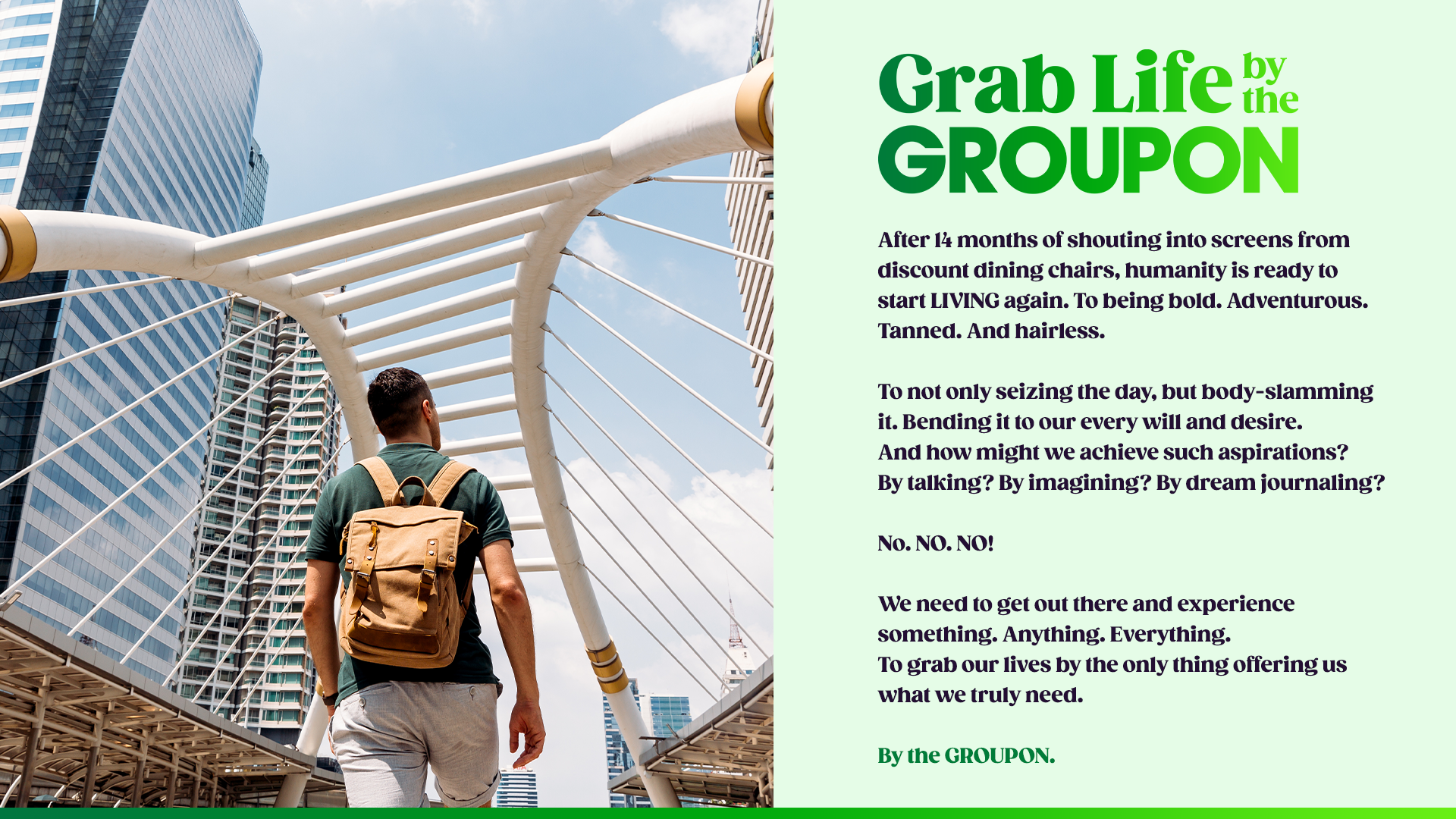
Experiential Photography
Photography plays a big roll in how Groupon communicated with the Everyday explorer, and it was mission critical for us to focus on using diverse experience driven photography for the new brand identity to set the stage for all the endless possibilities consumers can discover through Groupon. Images bursting with life, energy and endless wonder really set the tone for for Groupon’s new experience driven platform. Engaging lifestyle and POV photography placed viewers front and center into an experience as if they were right there in the midst of all the fun, relaxation, and mouth watering possibilities available at their finger tips.


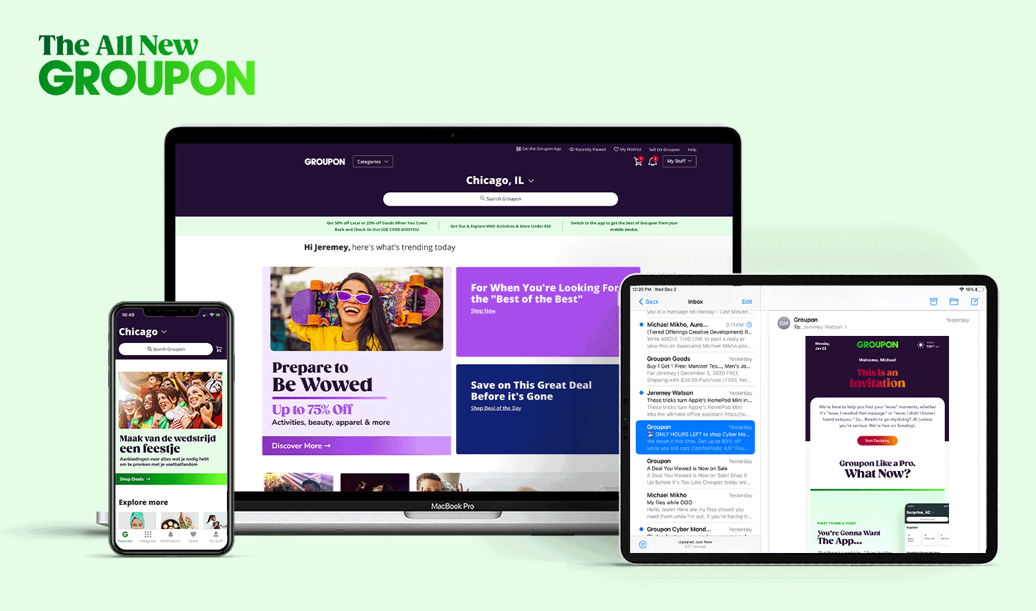
The Campaign


Bringing it All to Life!
To complement compelling visuals and headlines, we modernized Groupon's core customer experience. Our internal creative agency partnered with Product & Engineering to overhaul the web and app experience, reflecting the rebrand's focus on the "Everyday Explorer" demographic. This was achieved through a refreshed website and app, vibrant colors, experiential photography, a new tone of voice, playful typography, and a refined merchandising approach.